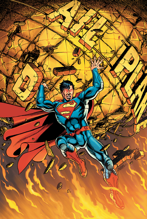
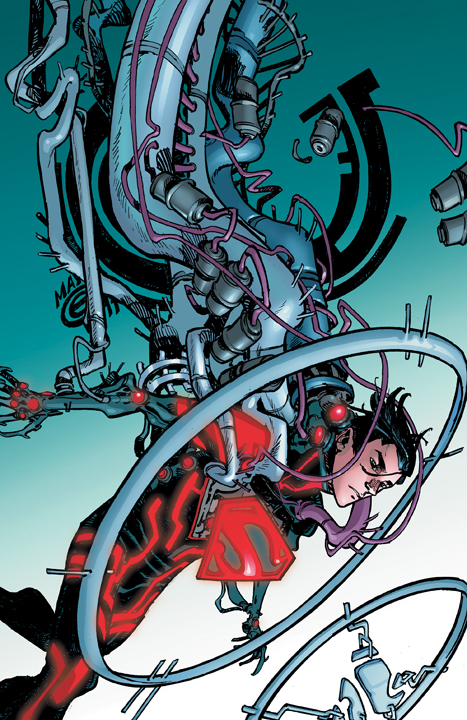
Ward Sutton and the Village Voice Illustrate The Daily Cocca? (I Did See Michael Musto on a Bike in Chelsea Once)

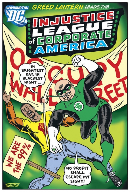
Do Ward Sutton and folks at the Village Voice read The Daily Cocca?  You know I like to think so.

Finally, there’s proof. Via Graphic Policy:

See 7 more designs at “Washington DC Reboot” via the Village Voice.   We anticipated as much here on November 1.

In related news, NPR basically endorsed Newt Gingrich yesterday, perhaps not realizing what they were really saying by saying a Newt presidency would bring back the 90’s.  More to come on that later.

DC Reboot: Superman #1, Batman #1, Flash #1

From when the New 52 was still new:

As you might recall, I really liked the social justice superheroics of Action Comics #1.  Last night, I finally got around to reading Superman #1, Batman #1, and The Flash #1 and wanted to share my thoughts.

Superman #1:  Very ambitious.  We have the struggles of new vs. old media, the problems with media conglomerates in general, Superman as guardian of the past, Clark Kent rejecting a sweet cable news deal because 1) he despises cable news and 2) millions of people would see his face every day, like, forever, a Perry White full of vim and vigor, saying “let’s show them the hard-hitting analysis that only print can deliver!”  A lot of things like that, which I eat. right. up.   The conflict between Supes and the actually “villain” of the arc wasn’t as interesting to me, but I do like the fact that the book serves as a one-shot while giving us the seeds of some classic arcs.  Clark loves Lois like Dobie Gillis loved Tuesday Weld.  And there’s even a young (much nicer) Warren Beatty type between them.

Unfortunately, the content of Clark’s exclusive story about Superman and the big incident, which we get in caption boxes, doesn’t feel like the front-page work of a great reporter.  I’m eager to give George Perez the BOD on this because 1) I’m a writer, and yeah, it’s freaking hard, and 2) he’s George Perez. Maybe Clark’s unpolished style is part of his cover?  There’s also a very strange crossover page from Stormwatch that makes Ben 10 look like Beowulf.

Overall, a good read with a lot of interesting things to say in the first half about history, time, urban renewal, economic decay.  I want to give it a 7 out of 10, but Action was so good, Superman feels more like a 6.5.  I’m conflicted.  I’ll go 7.  That seems high on a ten-point scale, but not as good when you think about it as a percentage and covert that to an an academic grade.  (This is why I blog).

7.

Batman #1:  The best of the bunch.    Bruce’s new contact lens tech is great, the Batcave looks great, and the internal monologue that stitches most of the story together is top-notch.  Bruce’s love for Gotham, and his investment in its future, could be a template for the philosophies of hope surrounding some very pressing real-world reclamation projects.  He exudes a strong ethos, suggesting that forward-thinking and risk-taking for the common good are moral virtues.  I’m not saying this was a civics lessons disguised as a comic book, but it was uplifting and hopeful.  Not something you tend to expect from a Bat-book.  And did you notice that I keep saying “Bruce”?  That’s an effect of good writing and successful character development in a matter of pages.   This still isn’t a book for kids, as a crime scene near the end (central to the hook for issue 2) reminds us.  If you’re looking for a Batman title for younger readers,  The Brave and The Bold is good  if you don’t mind mostly slap-stick violence.

8.6

Flash #1:  There’s a very special place in my heart for the Flash.  But my Flash is and always will be Wally West.  Jay Garrick is my second favorite.  That’s not a comment on my feelings about Baby Boomers in general…Wally is the Flash I grew up with, an imperfect hero struggling with all kinds of emotional issues and mentored by an icon from the Golden Age.  What’s not to love?  I totally get that Wally’s favorite Flash is his uncle, original mentor, and former partner, Barry Allen.  I totally understand the overwhelming sense of loss that pervades Wally’s Flashness, especially in the 90s, is what makes his character so compelling.  I also love that he’s a screw up.  I’m not 100 percent sure where he’ll shake out in the new DCU, but I hope there’s a prominent place for him.  I hope he’s not de-aged like all the Robins, but I suppose he has to be if Barry and Iris aren’t married yet.

Onto the Barry-centric book at hand.  Loved the splash page.  Captured the Silver Age feel that brought us Barry in the first place.  The story moved quickly (ha) and ended on a cliff-hanger that has me interested.  It felt like a younger read, something akin to those titles from DC’s early-90’s Impact line.  (The Fly was my favorite).  Since Impact was meant to introduce new, mostly younger readers to old characters at an accessible level and the reboot is meant to do the same, mission accomplished.   The Flash has always been one of the most kid-friendly of the major DC heroes (emotional issues that we adults love aside), and I think that will continue.

It was a fun read, which is the point of a Barry book.  I don’t like the new suit.  Too panel-y.

8

A good mix, but nothing touches Action.

Is This The Rest of the Rebooted Justice League?

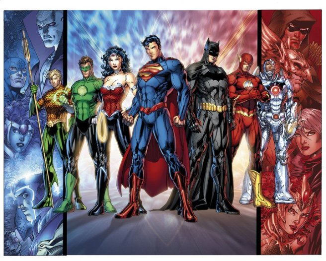
Via Graphic Policy, this image is out and about today, but does it show the rebooted Justice League’s full roster?:

Who knows. But the statement about DC’s new “Big 7” is clear: Green Arrow out, Cyborg in. I still want the League’s Green Lantern to be John Stewart, but I hope he gets a big starring marquee role somewhere else in the new DC Universe.

A few thoughts on aesthetics:

By now, we’ve had some time to get used to all the lines and panels in these costumes. I still don’t like them. There’s too much quasi-realism going on, especially with Superman. Then look at Flash’s boots. Them compare them to whatever Hal Jordan has on his feet (classic boots? Fine, but next to the overwrought and inexplicably shiny things the others are wearing, they look like pajama feet).

I do like how the S-shield pops on Supes. Still not fan of the red seat-belt on his waist.

The Blue Beetle
Remember that time I got one good story ever and died at the end? The WORST.

What we can’t tell from this image are the places of the secondary and tertiary heroes on the side panels in the new DCU. Are they JL subteams? I like that idea. Are they field agents? I’d like that, too. Side question: How do Hawkman and Green Arrow feel about not having a place at the leadership table? How about their fans?

In short: good image, good team, still some mystery. Please, less panels and piping. We’re not making movies, here.

Right.


(Blue Beetle/Ted Kord image by Lunchbox Photography via Flickr)

A Teen Titans Reboot Image You May Have Missed: Red Robin Glides, Superboy Flies, Bart’s Cowl is Strange. And There’s A New Guy.

If you’re here to read about the DC Comics reboot, you probably already know the news that’s come out since my last Titans post:

  • Bart Allen is Kid Flash (good).
  • Red Robin’s feather-cape lets him glide (okay, but from what does he propel?)
  • Red Robin has a jet-pack (oh, that’s right. So it’s not like the old Spidey cartoons where Spidey is just shooting up webs in the middle of fields and spiriting away after IceMan and Firestar).
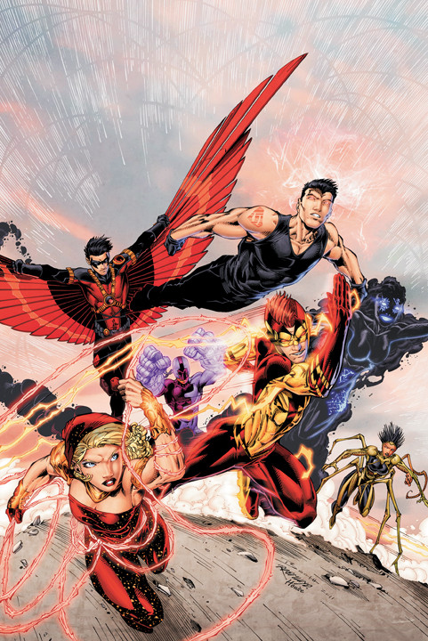
  • The girl with the Feral hair is being called Bug Girl in promotional convos by the creators, but I don’t think that’s her real name.  Now, your Daily Cocca thinks all the hatred going Bug’s way is pretty strong tea, but I’d be lying if I said my first impression of this character wasn’t “1993 called, in bad way.”

Now for the newish image, which you may have already seen elsewhere but I completely missed:

S-boy’s gloves are an intentional homage to the character’s 1990s origin.  I guess that’s cool, even if it’s superfluous.  The modern Superboy didn’t really come into his own until the last decade and the fashion sensibilities that came with it.  Note to DC: Black t-shirts and blue jeans will probably always be cool.  I’m not sure about the muscle shirt here.  I want to commit to hating it.

Red Robin joins Bart in the shoulder-insignia club.  Maybe Tim’s does something.

There’s a new dude in the middle.

Bart’s cowl looks funny.

Should DC Have Revisited “Titans Tomorrow” for the Superman Reboot/Redesign?

I think so.

I’m still not a huge fan of the red belt pictured here, but it’s a huge improvement over what they’re actually giving him:

Must. Collect. All. Thundercat. Emblems.

I could have sworn that one of the panels I saw during the Titans Tomorrow storyline showed a belt that stopped on both sides before reaching the abs. Even if I’m misremembering that, I like it better than either of these options.  For an even better old revamp than the Titans Tomorrow design, check out what artist Sean Izaakse did in 2006:

Super, regal, updated, and iconic.

Here, the collar, cape, and shield work together to really say something about Superman’s power  Change the waist banding to a red semi-belt and that’s your rebooted Man of Steel, friends.

Superman Pictures from “Action Comics” and “Superman” DC Reboots. Also, SuperEmoBoy.

One of these pictures is awesome.  One of them, despite my George Perez fandom, isn’t.

Awesome.
Isn't.

It’s not Perez’s fault.  He’s dealing with a redesigned Superman costume that isn’t his, and the inker made the space above Supes’ boots look gray/silver.  Here’s the overarching technical problem with the new suite: maybe it will work okay when Jim Lee is drawing it on a stylized, younger-looking Man of Steel, but it just isn’t going to work across artistic styles.  George Perez is an iconic Superman artist, and look how hamstrung this costume makes him.  The classic costume works in any style because it’s simple and iconic.  The new look has panels and too many lines. The belt’s over-thought.  The collar’s too high.  No red undies. Wrong wrong wrong.  Superman doesn’t need bells and whistles.  That’s the point.  That’s his deal.

Argh.  This is 90s in a bad way.  I know, you thought that was impossible.  So did I.

Then there’s this:

Booo.

DC’s Superboy, Red Robin, and Kid Flash Reboot For New Teen Titans Book (And I Think of the 90s)

This post is from 2011.  As of 2018, it still gets new views. The Teen Titans, not to mention the entire DC Universe, have gone through many iterations since then.  Why are fans able to accept that continuity is fluid when it comes to comic books, but not when it comes to properties like Star Wars or the Wizarding World?

To be honest, I don’t really accept a living Jason Todd, or a universe in which Tim Drake was never Robin.  But I also know that the pendulum will likely swing back, and that I get to pick what I consider canon.  That’s one of the great things about fiction.

Okay, so I think of the 90s anyway. That said, here’s the picture for the rebooted Teen Titans:

I was chatting with someone today who said this whole reboot reminds him of the 90s, and, specifically, what Marvel tried to do with Heroes Reborn.  The Superboy and Kid Flash designs specifically make me think of 90s aesthetics.  That patch on Bart’s left shoulder?  Reminds me of Jim Lee’s first shot at redesigning Superman, circa 1996:

Kid Flash should be minimalist and throwback.  When Bart Allen gave up the Impulse identity and became Kid Flash, it was in honor of Wally West and his costume reflected the importance of legacy in the Flash mythos:

This is the right look, but the boots are too busy.  The thing going on at the top of this post is just a mess.

As for Superboy. If you were 13 in 1993, you know that the modern incarnation of the Boy of Steel debuted during the Reign of the Supermen arc following Superman’s death. He was punk, and he looked every bit the 90s awesome he was meant to be:

Haters hate, but I think this costume was perfectly awesome for the time.  And yes, after seeing this, I did go home and try to draw Starter jackets for Wonder Woman, Batman, Superman, and the Flash.  That said, I think everyone agrees that Superboy’s most recent look is 100% DCAT (Don’t Change A Thing, with thanks to Paul Lukas):
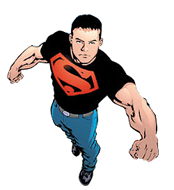
This has become Connor Kent’s iconic Superboy look.  In the solicit picture for the reboot, he’s back to being a scenester.  What’s with the gothy tape job on his back?  The bar-c0de tattoo?  What could possibly tattoo him, anyway? For that matter, how did he pierce his ear in the 90s?  I know, I know: same way he shaves (his own heat vision in a mirror).

Red Robin (Tim Drake, formerly the third Robin before becoming Red Robin in the current DCU) is said to be leading the new new new Teen Titans.  I liked the Kingdom Come-inspired Red Robin costume of the last two years, and I liked the red and black look Tim sported during his final stint as the Boy Wonder.  Now he has feathers.  I want to say I hate it, but I sort of don’t.   Tim’s original costume was, perhaps, the perfect union of 90s re-design and timing.  It was current, believable, and, most importantly, not ridiculous.  The cape was black, the legs were covered.  The R was finally stylized.  He got a bo-staff and real boots. He got his own book and became a sidekick who was always more than that.  Tim was the best of the all the Robins because Tim’s  skill set, intellect, and emotional complexity made Robin a real hero in his own right and a compelling character to boot.  Tim Drake did for Robin what Nightwing did for Dick Grayson.  It makes sense that Tim would keep part of the Robin identity even as he moves on, but I’m not sure about those feathers.  Why not the current Red Robin costume with a domino mask instead of a cowl?  The rest of what’s going on above is way too busy.   I know that the hooded Robin look is being done by Damien Wayne, and Tim’s Robinmobile is called the Redbird.  I get that Tim ought to retain some of that mythos and the feathers signal the Tim (as opposed to Damien) side of things, but still.  Unless he starts to fly (please, no), he really shouldn’t have them.

If the 200os saw DC return to the Silver Age in terms of story and allusion, it feels like September 2011-forward are looking like the 90s redux.  Short from letting Supes fly his freak flag every now and then, I’m not sure that’s the way they should be going.  Then again, I was one of those kids that started reading comics because of the Batman movie and then in earnest with the Reign of the Supermen and the Knightfall series.  One of DC’s immediate goals is to give new readers and brand new point of entry, and the reboot and renumbering certainly provides that chance on a massive scale.  Still, feathers?  You know what? I’ll admit it.  He does look kind of cool.