This is one in series of quick takes on various logo updates for 2020. No one has the energy for clever deep dives right now, myself included. So I try to get right to the point.
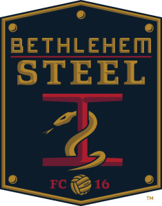
This one is a little personal for me. Union II was, until last year, a new iteration of Bethlehem Steel FC. I live in the Lehigh Valley, and Bethlehem Steel, the company (which officially closed in 1996) remains iconic in local and American history even now. In its heyday, it employed thousands and thousands of locals, pumped out steel that helped win WWII and build the Golden Gate Bridge. It also sponsored the original Bethlehem Steel FC, a legendary club from the days of the professional industrial leagues. My great-grandfather worked for Bethlehem rival American Steel (owned by JP Morgan) and was, himself, an industrial league semi-professional athlete. Family legend says he once out-pitched Satchel Paige in a barnstormer, and I’ve decided to take that as fact.
Anyway, I’m not a huge soccer fan, but am I huge mark for anything historical. I liked having the Bethlehem Steel FC iconography revived, and I thought the team’s logo was good. It incorporated the classic Steel imagery with the Union’s excellent snake.
Here are the reasons for the team’s departure. It’s a bummer, especially considering that the Lehigh Valley metro is, according to many metrics, able to support an MLS team of its own.
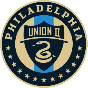
As for the new logo of the rebranded squad, meh. It’s just a rehash of the Union’s (very fine) visual identity.