You don’t have to be a Mets fan (why would you ever be?) to love Gary Carter. This is from the 1984 press conference welcoming him to New York. Montreal would never be the same.

You don’t have to be a Mets fan (why would you ever be?) to love Gary Carter. This is from the 1984 press conference welcoming him to New York. Montreal would never be the same.
This is one in series of quick takes on various logo updates for 2020. No one has the energy for clever deep dives right now, myself included. So I try to get right to the point.
I don’t know if it’s just in PA, but “Kelly Green” has been trending off and on for a few days. If you don’t know, Kelly Green is the Ideal Form for all Eagles colorways. It’s not even close.
The team’s current shade, Midnight Green, was introduced in 1996. It holds up, but it’s been 24 years since the classic colors worn by Bednarik, Jaws, Randall, Reggie, Keith Jackson, Seth Joyner, Jerome Brown, Dick Vermeil, Buddy Ryan and more took their rightful place as the team’s defining visual element.
Fans and even players have been clamoring for a return, typically hoping for a Kelly Green alternate set. The problem? The NLF mandates that every team have only one helmet shell (facemasks can be changed, and decals are changed after every game) due to safety regulations. Kelly Green jerseys with Midnight Green helmets is a crime against design. Short of a rule change (which may happen next year), the only way to keep both shades of green in rotation is to change helmet shells to a more neutral color.
Of course, the Eagles have rocked white helmets before, and they could make for a good throwback. Silver is another possibility, but that feels too much like Seattle and Dallas.
The answer, of course, is to get rid of Midnight Green all together and do this:
Problem solved.
This is one in series of quick takes on various logo updates for 2020. No one has the energy for clever deep dives right now, myself included. So I try to get right to the point.
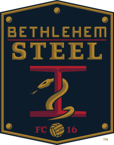
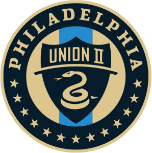
This one is a little personal for me. Union II was, until last year, a new iteration of Bethlehem Steel FC. I live in the Lehigh Valley, and Bethlehem Steel, the company (which officially closed in 1996) remains iconic in local and American history even now. In its heyday, it employed thousands and thousands of locals, pumped out steel that helped win WWII and build the Golden Gate Bridge. It also sponsored the original Bethlehem Steel FC, a legendary club from the days of the professional industrial leagues. My great-grandfather worked for Bethlehem rival American Steel (owned by JP Morgan) and was, himself, an industrial league semi-professional athlete. Family legend says he once out-pitched Satchel Paige in a barnstormer, and I’ve decided to take that as fact.
Anyway, I’m not a huge soccer fan, but am I huge mark for anything historical. I liked having the Bethlehem Steel FC iconography revived, and I thought the team’s logo was good. It incorporated the classic Steel imagery with the Union’s excellent snake.
Here are the reasons for the team’s departure. It’s a bummer, especially considering that the Lehigh Valley metro is, according to many metrics, able to support an MLS team of its own.
As for the new logo of the rebranded squad, meh. It’s just a rehash of the Union’s (very fine) visual identity.
This is one in series of quick takes on various logo updates for 2020. No one has the energy for clever deep dives right now, myself included. So I try to get right to the point.
Have you seen the new Chargers unis? They are good. Each and every one of them:

Seriously, there’s not a single misstep here. Yes, incorporating at least one blue helmet would be even better, but there’s a league rule about only one base color.
The four combinations on the left are obviously my favorites, and it’s hard to pick a winner between them. If I had to cut one, it would be the all-white, which makes the white jersey/gold pants my road choice. Both home combos are outstanding.
From a few years ago. Still pertinent. The Phillies are, once again, rebuilding.

I was so pleased when Hobart published this in the middle of the season last year. With pitchers and catchers upon us, I wanted to share it again.
![]() Bummed about the Spurs? There’s still baseball. Read my new essay, freshly published at Hobart, about how I learned everything I know about postmodernism from the Phillies. If you’re feeling dejected about last night’s Big Game, you’ll find some succor in this piece, I think.
Bummed about the Spurs? There’s still baseball. Read my new essay, freshly published at Hobart, about how I learned everything I know about postmodernism from the Phillies. If you’re feeling dejected about last night’s Big Game, you’ll find some succor in this piece, I think.
Many thanks to editor Aaron Burch.

