You don’t have to be a Mets fan (why would you ever be?) to love Gary Carter. This is from the 1984 press conference welcoming him to New York. Montreal would never be the same.

You don’t have to be a Mets fan (why would you ever be?) to love Gary Carter. This is from the 1984 press conference welcoming him to New York. Montreal would never be the same.

Libertate made the title of this post possible. Thank you, Libertate.
Click through to see that these items aren’t really just for Libertarians. Classic American political philosophy is awesome, and so is the Gadsen flag.
From the summer of 2011.
One of the more humorous facts about the inner workings of this blog is that almost once a day, someone finds their way here by searching “dad shorts.” Just over a year ago, I wrote a short post about how I was shopping for summer clothing and almost talked myself into spending hard-earned Kohl’s Cash on a pair of shorts that were clearly made for men born before 1965. I tried them on. I liked them.
Then I came to my senses. This episode did, however, raise an important question: while I may (always) be too young for shorts that ride that high above my knee (hold your breath, ladies), when does a man become too old to buy the dad shorts’ polar opposite (which are, course, cargo shorts)? One of my friends insists that 30 is the absolute cut-off. I’ll put the question to you, my stylish readers.
In the meantime, I wanted to share an image I captured this very evening:
This display is supposed to say “Thanks, Dad” and “Men’s Shorts.” But we all know what it really says, and what these items really are. Happy Father’ Day, all you dads of America. Wrangler wants no more of your modest, tasteful ways.

By the way, if you go ahead and follow up on that urge to Google “dad sorts,” you’ll find that my post from last year is the second result, which is bizarre. If indeed I coined this term (as now seems obvious), I think Wrangler owes me a piece of this year’s retail action, don’t you? And anyway, I basically kept their “husky” line in production circa 1988. Yes, they actually called them “huskies.”
Mom: “No, honey, they mean husky like the brave strong dogs that pull the sleds.”
Me, in tears: “N…nn…not like husky as in…fat?”
Mom: “No, dear, like the brave and noble dogs that are the lifeblood of the Yukon wild.”
Me: “Well that sounds pretty awesome. And also, I’m hungry.”
You know what? Forget you, Wrangler. And your sneering 1980s product lines.
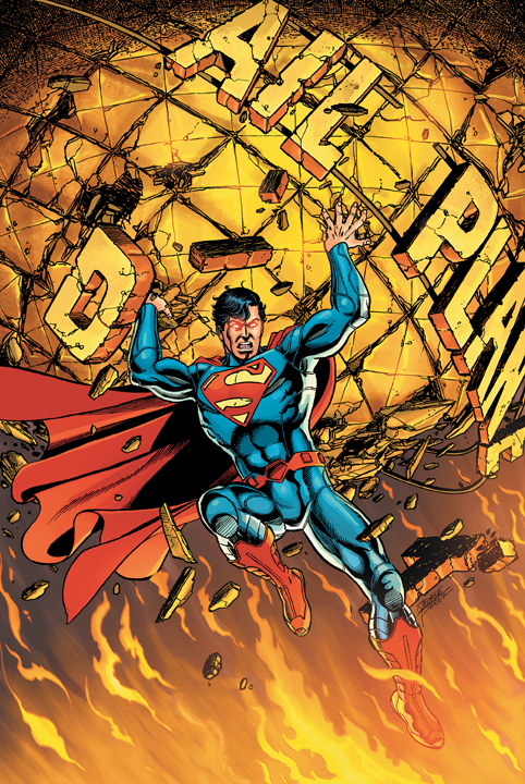
I’m still not a huge fan of the red belt pictured here, but it’s a huge improvement over what they’re actually giving him:

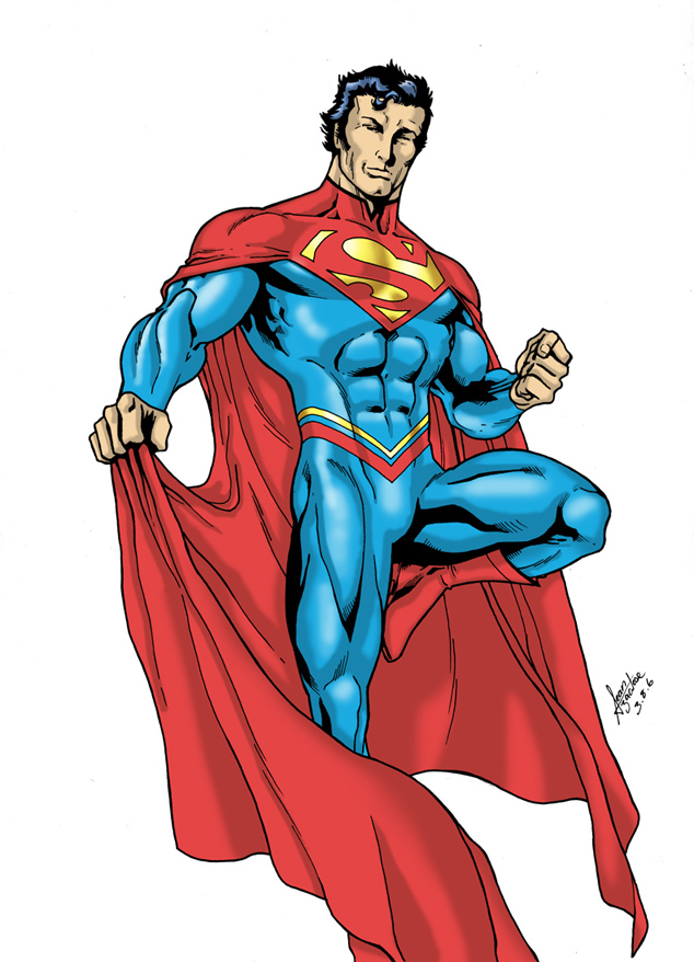
I could have sworn that one of the panels I saw during the Titans Tomorrow storyline showed a belt that stopped on both sides before reaching the abs. Even if I’m misremembering that, I like it better than either of these options. For an even better old revamp than the Titans Tomorrow design, check out what artist Sean Izaakse did in 2006:

Here, the collar, cape, and shield work together to really say something about Superman’s power Change the waist banding to a red semi-belt and that’s your rebooted Man of Steel, friends.
From June 4, 2011. I don’t think Project: Rooftop updates very often, but with the Aquaman movie coming out soon, this post is picking up some steam.
I recently concluded my MFA studies at The New School. Apart from doing a creative thesis, I had one personal goal during my time at TNS, and that was to meet Tim Gunn or Heidi Klum. I’m sorry to say that I failed in that endeavor. I’m even sorrier to say I didn’t really try. But I did see Chris March and Michael Musto on my first day in the City. March walked past me in Chelsea, and Musto was riding a bike in Midtown. Some of my friends from the program have Michael Khors stories from the nights I didn’t go to Cafe Loupe. Alas.
Yes, I watch Project Runway with my wife, and yes, I’m an even bigger fan of On The Road With Austin and Santino than she is. You also know that I’m a comic book nerd and a nut for sports uniform minutiae. Put all of these things together to understand my love of Project: Rooftop. Warning: If you’re like me (that is, if you’re even still reading this post) you could easily sink a few hours into this site. The premise is sublime: brilliant artists enter contests to redesign famous characters, and we all get to see the fruits of their labors and hope someone in editorial at Marvel or DC draft some of these folks for some serious work.
I said yesterday that the animated Batman: The Brave and The Bold version of Aquaman is my favorite incarnation of the character. No doubt. Second place is the nineties version. But check out this redesign by Otoniel Oliveira:

Nevermind that this is exactly what I expect to look like when all the ice caps melt, this is just a pretty awesome-looking dude. Aquaman can be cool. Fine, fine, it’s mostly the hair and beard I’m digging. You get the point.
I also wanted to share this next picture of Aquaman as a hipster by Yasmin Liang:

That is one impressive stache.